|
People often ask, can you use a Keynote presentation on windows. The best way to play a Keynote presentation on Windows is to save it as a PowerPoint file. To save a copy of a Keynote presentation in another format, you export it in the brand new format. This is helpful when you need to give a presentation to somebody who is employing different software. Any changes made to the exported presentation don’t affect the original. To export it to PowerPoint file, simply click File >> Export to > PowerPoint 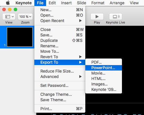
0 Comments
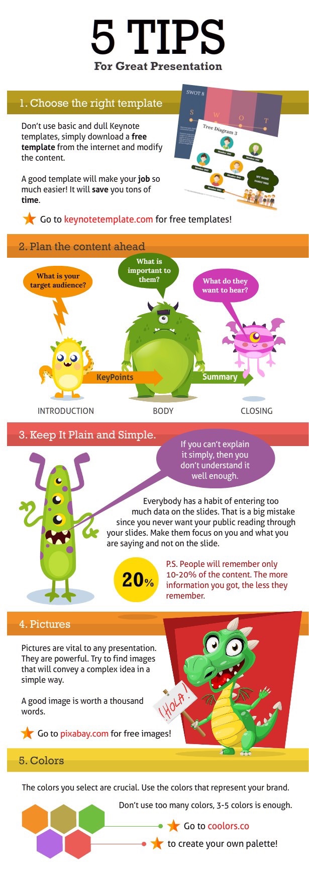
 1. Start with a bang.
For example an anecdote, a break. Most listeners only remember the beginning and the final point of a lecture. That's why both should sit. Anyone who can not think of anything at least tells the audience why the coming will affect their lives. 2. Concentrate on the essentials. A successful presentation is based on the listener, is therefore short, follows a logical structure and encourages people to think along. As a rule of thumb, you can remember: not more than ten slides per 20 minutes, the font size not less than 30 points, and do not overload the slides. Therefore no more than four words per line, not more than six lines per page. 3. Main things in main sentences. If possible, do not formulate any relative sentences, let alone nesting sentences. Only convincing main sentences with no more than ten words. Like this one. Repetitions are allowed, they even increase the noted effect on the listener. 4. Emphasize verbs. Most speakers focus on nouns. Not correct! Verbs, especially active ones, stimulate the brain much more and make the lecture exciting. With specialized vocabulary and foreign words, you can achieve the opposite. The same applies to superfluous animations or overloaded graphics. 5. First say, then write. Never read slides or flip chart sheets. First, it offends the intelligence of the listeners (who can read themselves); second, no one listens anyway, but first reads. Better: first elaborate the points verbally, then note down or fade in. 6. Keep eye contact. According to psychological studies: If you want to convince, you have to keep in contact with the audience at least 90 percent of your speaking time. The trick for the timid: just over the crowd. No one notices the difference - you just have to fly your eyes over your head regularly. 7. The conclusion remains. Therefore, the end always needs something inspiring, a view, something spectacular. But please no summary! Even a provocative question is better than having your speech rippled. And at the end never say thank you for the attention - your speech was brilliant, it goes without saying that the attention was undivided. Thanks to the pseudo-thanks, you only pretend to be small - as if you and the babble were in need of attention.  When a presentation is boring, confused or annoying, the culprit is quickly identified: PowerPoint. But with the presentation program from Apple (Keynote) can develop very convincing presentations. You do not have to be a talented graphic designer for that. The tips in this article, which are also suitable for a keynote or impress users, provide the tools for exciting slides.
The brain can not store anything it does not understand. The information of a lecture must, therefore, be displayed and transported in the right way, otherwise the messages will roll off the listener. The contents of a presentation are usually completely new, foreign material for the audience. As a speaker, you face the challenge of packaging your messages in a brain-friendly way so that they arrive and are stored. The following text contains tips on presenting that can be profitably implemented with Apple's Keynote. Slides are the central building blocks. A good start With your presentation launch you should get the audience attuned to the topic, curious about your solution and, if necessary, entertain a little. Curiosity is the key to attention. Effective ways to start a presentation: - Make a promise: "We help you halve the number of complaints." - Impress the audience: "9000 kilometers of cable." - Illustrate a problem: speeding ticket, broken disc, falling sales figures - Tell us a case story: "Our client needed 100 new skilled employees in one week and we got them to him." - Ask a knowledge question: "What do you think costs the operation of your refrigerator in the year?" - Ask an implied question: "We've been wondering for a long time whether we should develop or outsource ourselves." - Ask an interactive question: "Who of you plays games on the phone?" - Use humor and fun In no case begin with the history of your company and at first only present in detail, if it makes you curious about your findings and experiences. People only want to know who you are, if they have previously convinced themselves of the benefits of this message. The more "huh?" The better Many Keynote users believe that every slide needs a headline, plus text or lists, plus a picture or chart. You want to make the slides as complete as possible - perhaps also to distribute them in print after the talk. In addition, when viewing the slides as possible no questions arise. In a live presentation, however, you use it to leverage your most effective tool: the dialogue that also activates the audience. Self-explanatory slides prevent this dialogue and make the speaker almost superfluous. But even if you talk during a presentation most of the time - a lecture is not a monologue, but an intense dialogue with the audience. To keep in dialogue, you should give your listeners also puzzles. A good foil is therefore recognizable because it is not self-explanatory. Design your slides so that your audience asks what they are meant to be - for example, show a torn bill, three blank squares, or a ketchup bottle. Curiosity is your ally. Your audience will want to understand the statements. It is you, as the speaker, who dissolves the riddle. You'll notice that initially, it takes guts to present non-self-explanatory slides, but the more "huh?" You can produce, the better. Infographics instead of bullets Around 80 percent of all slides show enumeration lists. This form of presentation seems obvious at first. Even at school, you learn to create structures, and for scientific documents and for structuring long texts, this often makes sense. In addition, Keynote literally tempts to create bulleted lists - the default content of a newly inserted slide is a text box placeholder. In order to convey ideas and knowledge in a presentation, however, lists are not suitable because they give too little information about the relationships between the list elements. If, for example, a process is to be explained, ie the enumeration list actually represents the individual stations of a workflow or successive stages of a development, then a representation along an arrow or a timeline is recommended. Other visual means are suitable for comparison or evaluation, often contrasting with pros and cons or plus and minus points. Finally, the list items may also be in a cause-and-effect relationship. Even if it is actually only a simple enumeration, say a few lines, noted with each other, little. An equivalent enumeration is an exception, it is only present if all points are equally important. In a prioritized list, some points have more weight than others and should be presented more prominently. Thus, the argument "two days coaching free" may be more important than the point "simplified registration". If multiple points can be meaningfully grouped together, it is a grouped enumeration, for example, constraints can be grouped into person, department, and customer related. This can be illustrated by suitable graphical means. Do not be fooled by the standard placeholder for texts to fill your slides with long texts or enumeration lists. One way to avoid text-heavy presentations is to consistently delete the standard text boxes. First, leave the overlying placeholder for the title in place and, as a preparatory note, write a complete idea based on the content of the previous slide. These entries serve as a preliminary idea. As soon as the slide is filled with content, the title placeholder including the noted topic can be deleted. Numbers and diagrams Presenting dry data and facts in an exciting way is an art. The best formula for numbers and diagrams is: prudence, simplify & visualize. Prudence: The most common mistake around numbers and charts is to leave the audience with analysis and interpretation. Instead, write the result of your own analysis on the chart, for example, "Physicians lack less than nurses." For slides with a chart, ask yourself: "What should the audience understand and remember when looking at the number graph?" That will be your headline. Simplify: Tables and charts are usually shown to substantiate a statement - as a kind of proof, so to speak. Here is: understandable is better than complete. Do you need all intermediate figures of the last years? Do you need the decimal places? What is really important to you? Show only information that your audience can capture in seconds. Visualize: Identify the essential numbers of the chart or spreadsheet and emphasize them extremely clearly. For annual or core numbers, it's best to use giant fonts that catch your eye. Your audience will be able to orient themselves quickly. The most important part of a diagram should always be most conspicuous, such as color, size, an arrow, or a red circle. In this way, you relieve the public and draw attention to the essentials. Avoid typical legends where the eye has to constantly go back and forth. Label lines or cake pieces directly. Use pictograms and small illustrations to visualize units. When it comes to houses, people, specific products or square meters, then put a large graphic of each on the slide. This is not a useless decoration but makes the context of the diagram at first glance clearly. If you only want to tell a few numbers, then choose font size 250. So your presentation will be a good entertainment show. Instead of showing all the numbers on one slide at the same time, they can also be presented one after the other - animated with transition effects. For example, to avoid confusion, numbers should always fly from the right into the image and back out to the left. As in the theater In order for the handling of texts, numbers, diagrams, and animations described above to become a habit, it helps to imagine the lecture as a play. The slide is the stage, the information units - texts, tables, graphics, and photos - are the actors. In a confused entry without tension, the audience does not know even after several minutes, what kind of piece is given. They then mentally leave the theater. Another problem: too many actors at the same time. Look at each element on the slide like a new actor you need to introduce to your audience first. Get the elements one after the other on your slide stage with simple overlay animations, but never more than three to five clicks - less is better. If there is an extra on the stage that you do not mention verbally, the audience will be surprised or cheated out of an explanation. Everything you show, you also need to address. Therefore refrain from any decoration that offers no additional information. Elements that show you but do not respond are superfluous and distracting. Imagine: The curtain opens and you see on the stage as a spectator instead of actors a canvas with the text of the piece, which they now have to read themselves. The pages of the manuscript are accompanied by comments by the director. This is how your audience feels when your slides consist mainly of continuous text and enumeration lists. With graphic elements, it is much easier to illustrate relationships, to structure information and to generate tension and curiosity. Anyone who is afraid of forgetting important information during the presentation should not misuse bulleted lists as a reminder. Instead, pinpoint important points for the presentation in the slide note panel and familiarize yourself with Keynote's new presentation view. Until the previous version, you could call this view only if the computer was connected to two output devices. Everything you have written down in order to explain it orally during the slide presentation is in a variable font size at the bottom right. Very useful is the overview of all slides, which you can reach via the second icon from the left in the bar below the preview image. If there are viewer questions about a specific slide at the end of the presentation, you can get it from the overview by clicking on the screen. End presentation effectively To end a lecture well, it is not enough to write "Thank you for your attention" on the last slide. Ask yourself what the listeners ideally think after the presentation or how they should act, and try one of these options for your final slide. This can be a solicitation, an offer, an invitation or a question. Also, a summary, conclusion or an example are possible. Regardless of your final word, give the audience another opportunity to ask comprehension questions. If you want or need to distribute material after the presentation, do not use Keynote's leaflets, but create a separate document. Use body text, which you structure with bold headlines as headlines. Use bulleted lists, checklists, infoboxes, graphics, and pictograms from your live presentation to optically lighten the picture. Here are some best websites around with free keynote templates and themes:
keynotetemplates.jimdo.com keynotetemplate.com etc.usf.edu/presentations/themes/ pinterest.com/keynotetheme/free-keynote-templates/ |